Working at BMW gave me the opportunity to interface with real products and real users, gaining valuable insights on how features are used and what exactly is important to drivers. With my team, I worked diligently to develop strong use cases for various feature sets within the app.
Charging Interruption Notification Strategy
EV's are new on the market and present significant challenges with new technologies. It's imperative to give drivers agency over their vehicles charge so as to mitigate emergency situations when charge gets too low on a trip.
The idea behind charging notifications is to put users minds at ease regarding "range anxiety" with EV's. Also, they provide context to drivers when charging is interrupted by overheating or power issues.
Ride History
BMW is currently in the development phase of a personal assistant within the vehicle to assist drivers with tasks. Originally, it was slated to carry over to the device, but this idea was scrapped early on. This concept shows a Ride History screen set that can also be standalone without the personal assistant functionality - however I've included it for demonstration purposes.
iOs Widget
One concept I brought to the company was for an iOS widget, shown in the sidebar on iPhones and other devices. I wanted it to provide a pared down experience of the app itself to give users relevant info at a glance.
Connection Indicator Logic
This is one of the features I saw from beginning to end, and is now live in the app. I made sure no stone was left unturned and conferred with developers to ensure that these kinds of notification styles were possible.
Trip Summary
This is a simple time-based logic proposal for how users can view a summary of their driving on a recent trip, as compared to past trips in the timeline. This is another conceptual piece which has yet to be implemented.
iOS STYLE GUIDE
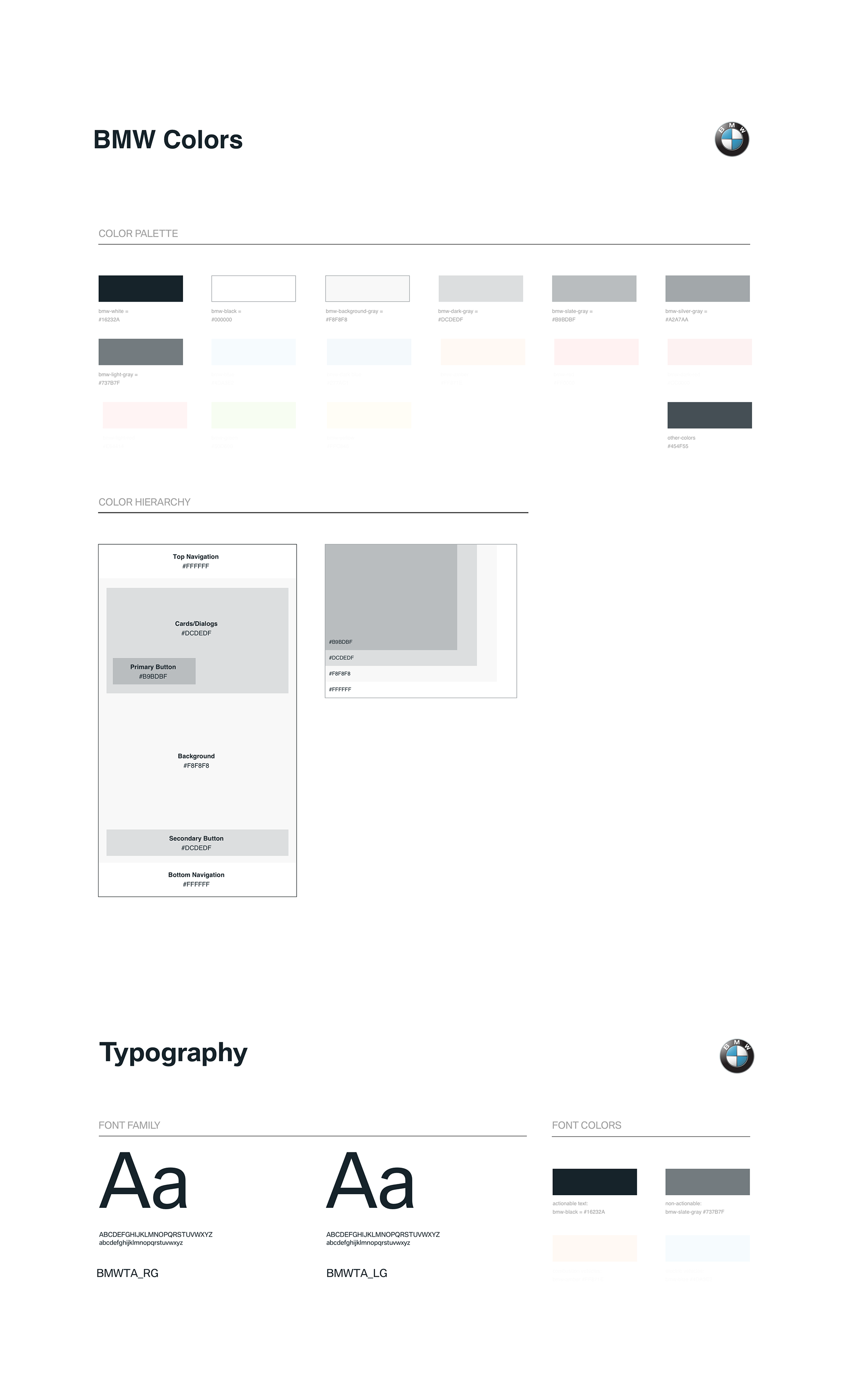
At the end of my internship, I was tasked with drafting up a UX Style Guide and Symbol Library that could be deployed company-wide and passed off to contractors and vendors when the need arose, so as to encourage consistency in wireframes and a quicker pass-off to UI. All symbols in the library had overrides for text and asset replacement, and were easily located once we standardized the Sketch Runner plug-in across the board.
My colleagues and I also standardized the color palette for various components, giving each element its own monochromatic breathing space. This was in 1:1 parity with the UI Style guide in order to aid the transition to final mockups. Flow arrows were made to be easily identifiable by colorblind designers, and comments/hotspots were standardized to assist with explanatory diagrams, conditional breakouts, and logic flows.


