I worked on the Aon website as a Jr. UX Design contractor for about three months this year, creating a lot of the main methodologies and ideas behind the site's general purpose and functionality. While on the Aon team, I had the unique opportunity to help an established corporation(who has had a website since 1995) reinvent it web presence entirely so as to more accurately reflect its brand, recommend services, and reposition itself as a global thought-leader in the areas of reinsurance, risk, and HR/retirement services. We were tasked with diversifying its content into short, medium, and long-form text pieces, as well as Reports, Podcasts, Videos, and other content. Aon also wanted to flex its data viz muscle by offering up interactive statistics for businesses to benchmark their potential risks against industry trends.
I participated in holistic reviews with stakeholders in order to establish a model upon which to base the website’s platform. This offered a way in which users could not only navigate articles and reports, but access the experts who could provide answers. This “open loop” could either lead them to a solution related to the article, or recommend additional articles and reports related to the original idea. These might be found internally at Aon or externally, such as from news sources.
Aon.com Home
I worked on a “quick action menu” that could be activated in any article, allowing the user to quickly navigate to experts, services, and related ideas, as well as copying a link or sharing to social media. This helped further the open loop from the genesis of user engagement, and funnel potential clients towards a solution while maintaining a “no-sell” outlook. This was eventually adopted into a tiered system that gathered related ideas and persons into thought groups called "vignette".
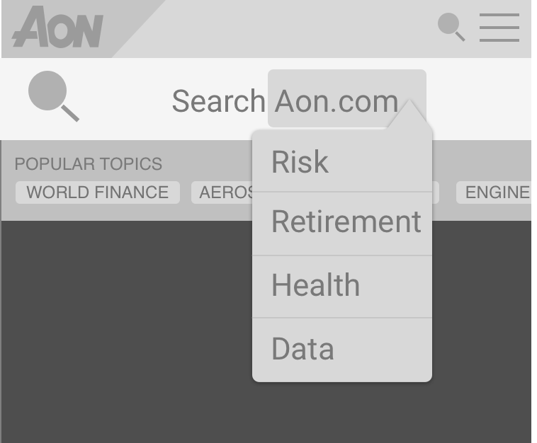
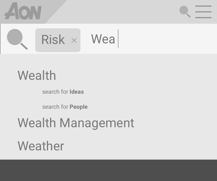
This flexible grid of articles, quotes, polls, images, and more was an initial exploration into how the homepage and search could work together. I worked on a tagging system that would allow topics to be grouped together for easier searchability and discovery through the open loop. The search bar itself was modifiable into a "direct search" for a specific area of the site. Then, an autocomplete search would assist you in selecting a content type, unless you preferred to search generally (Mobile versions below).
REPORTS
One of the biggest pieces I worked on at Aon was the re-creation of the reports section. Until then, reports were created as PDFs by a team at Aon, available for download by clients and colleagues. The website had landing pages (contracted to an outside developer) to introduce the subject matter, which then merely linked to a non-interactive PDF of the full report. We sought to combat this disconnect by offering a web-based version with interactive reports that offered benchmarking to clients as a way to incentivize a paid subscription to Aon’s big data services.
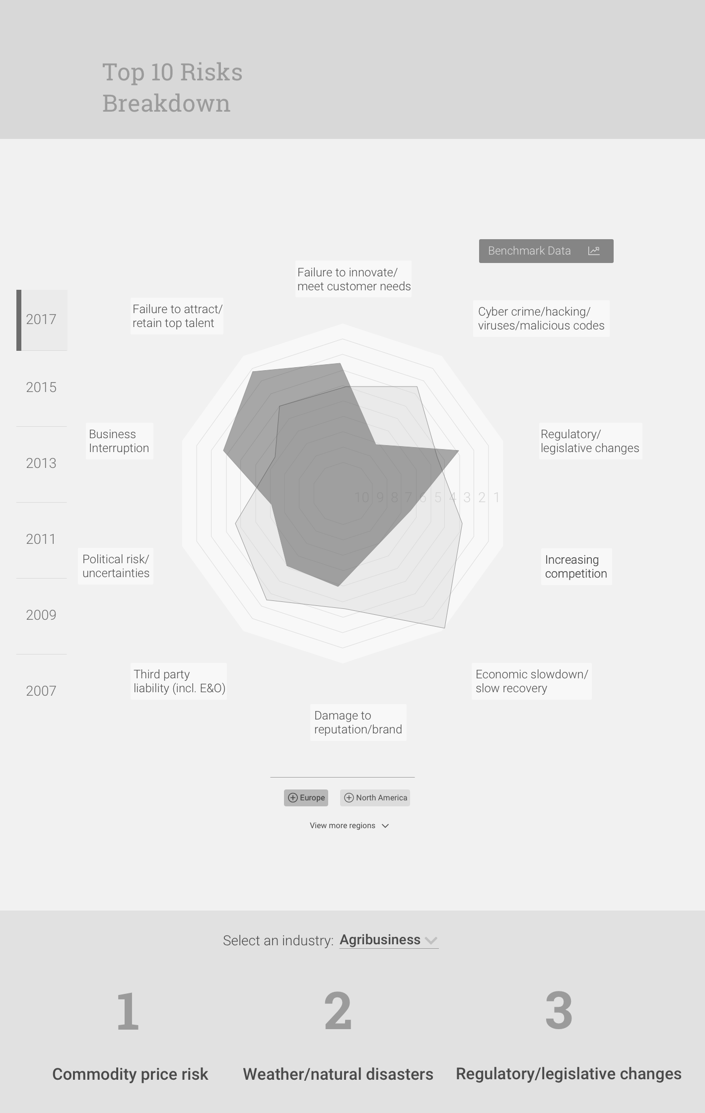
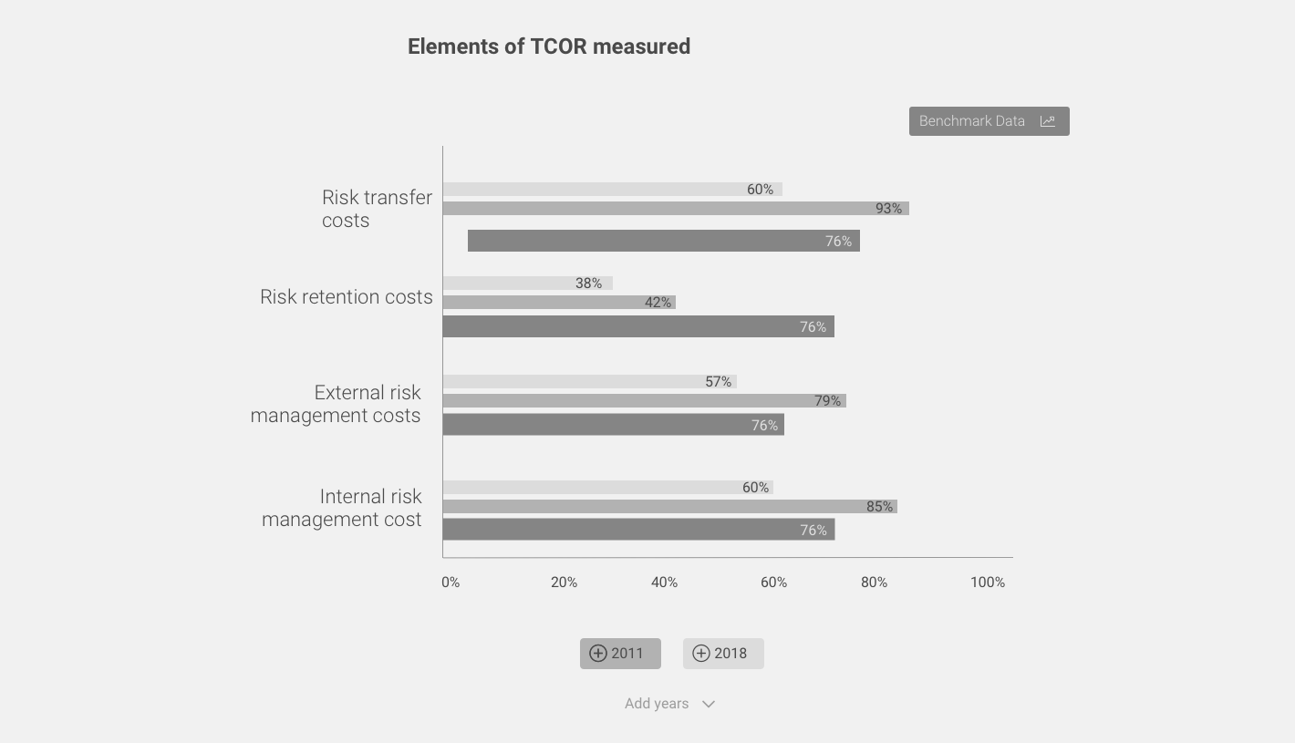
Below are several data visualizations for risk modeling and prediction, as well as benchmarking for various graph types and tag-based filtering systems to adjust the scope of the infographic.
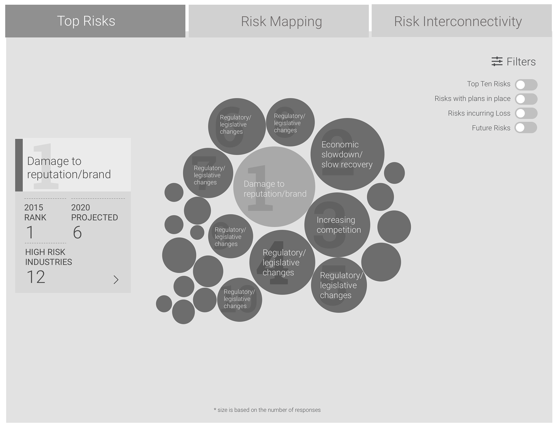

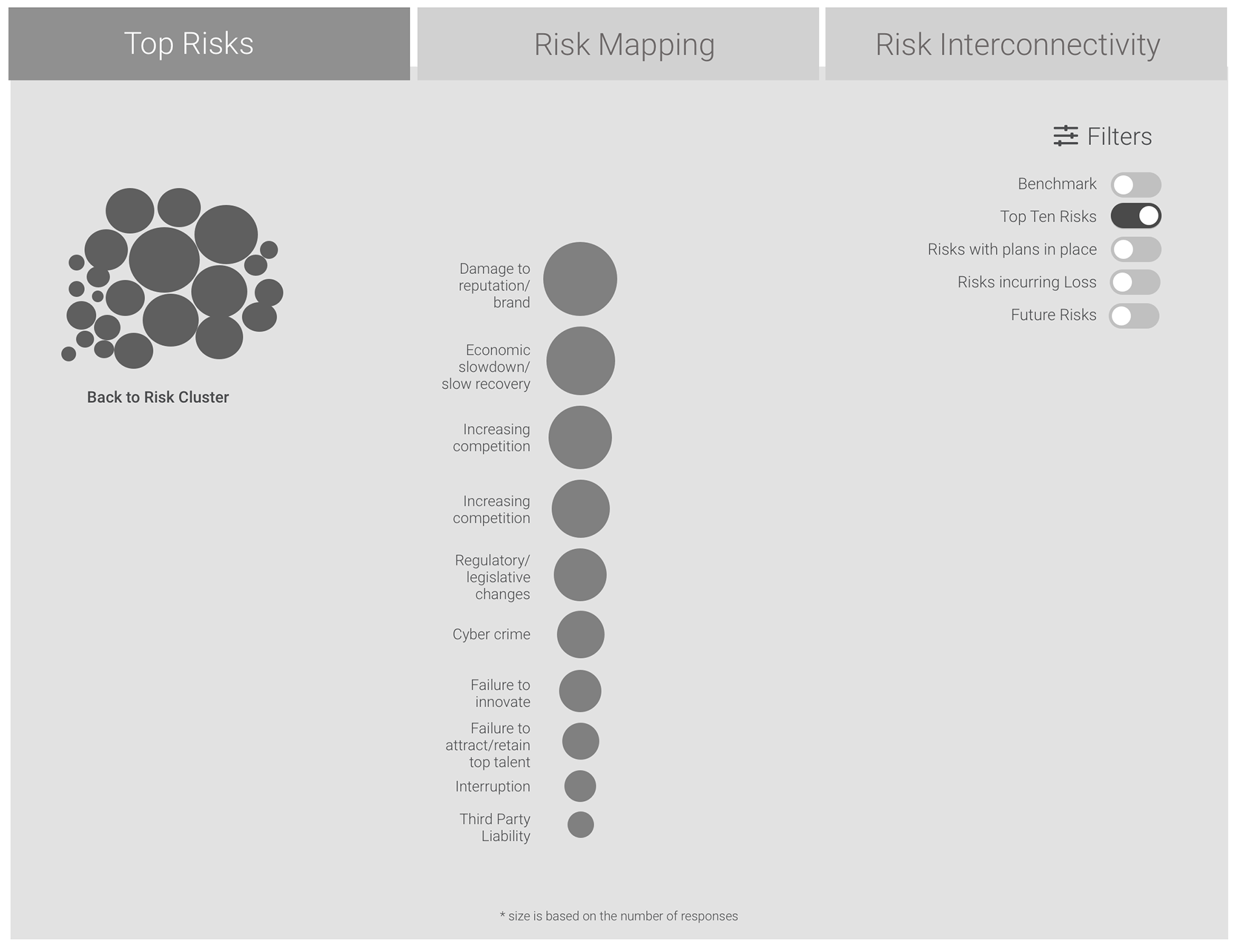
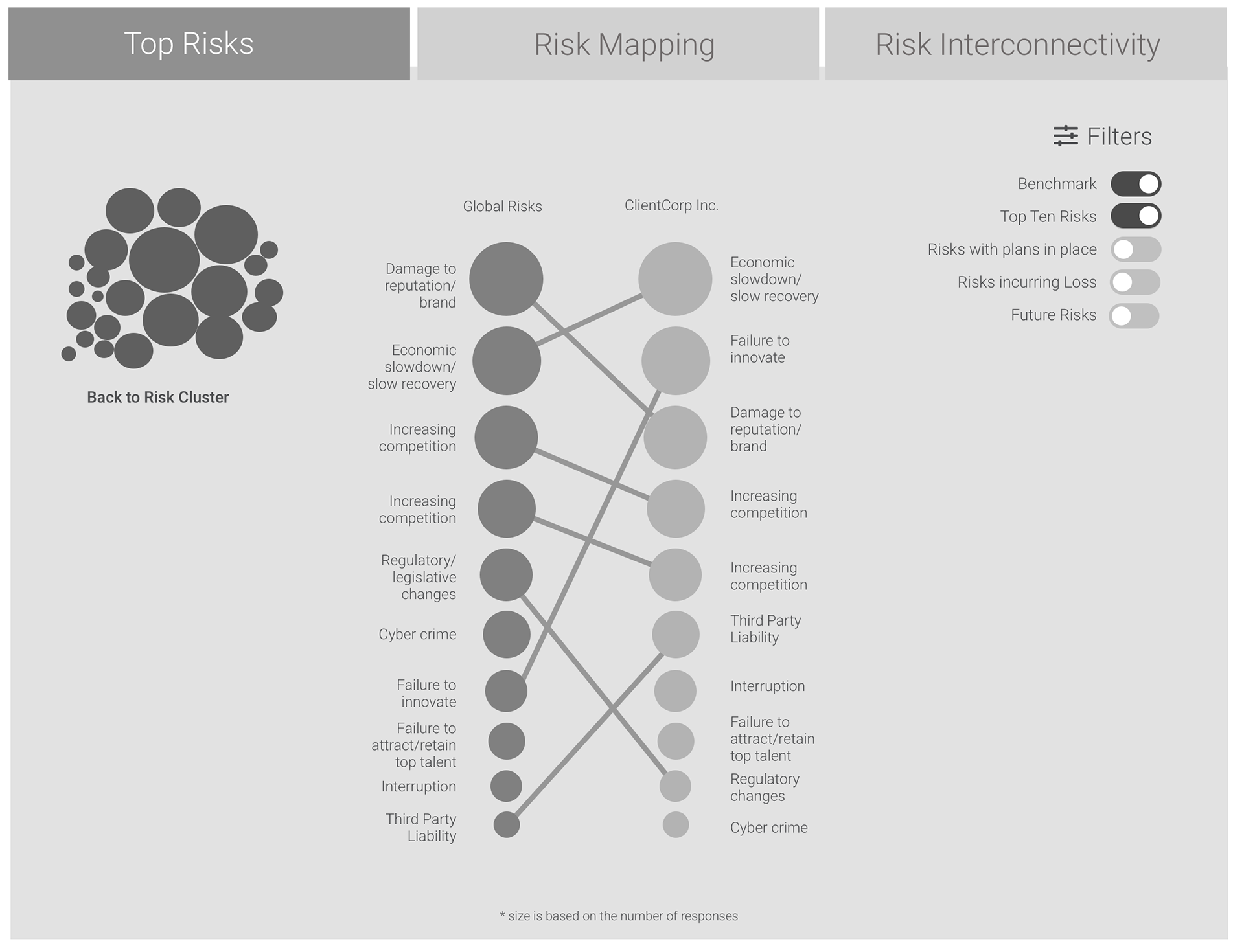
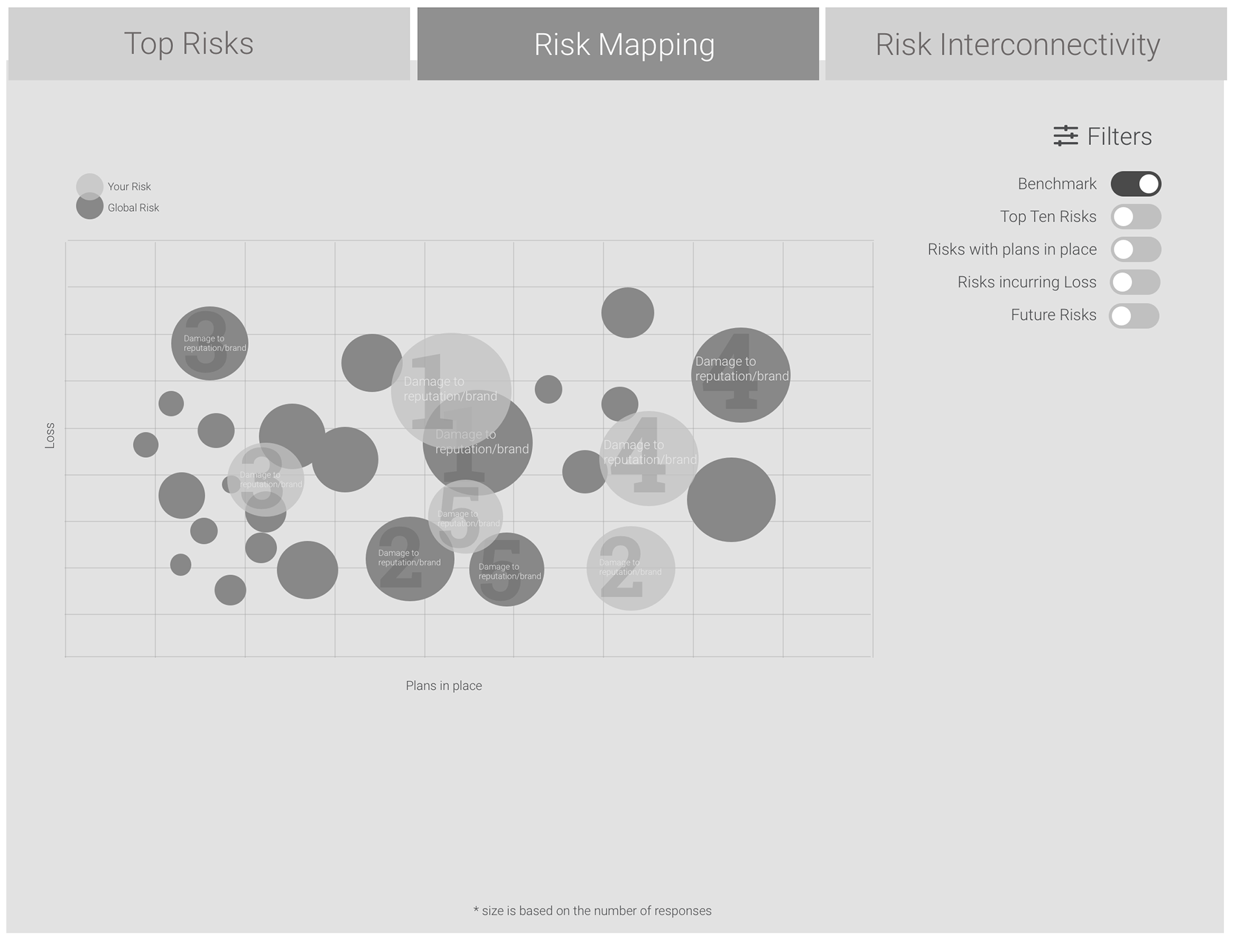
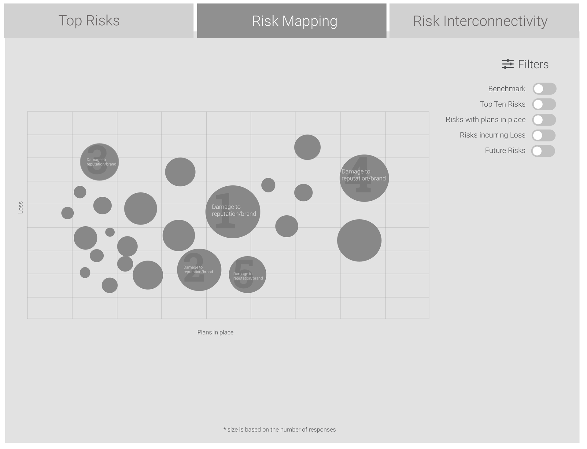
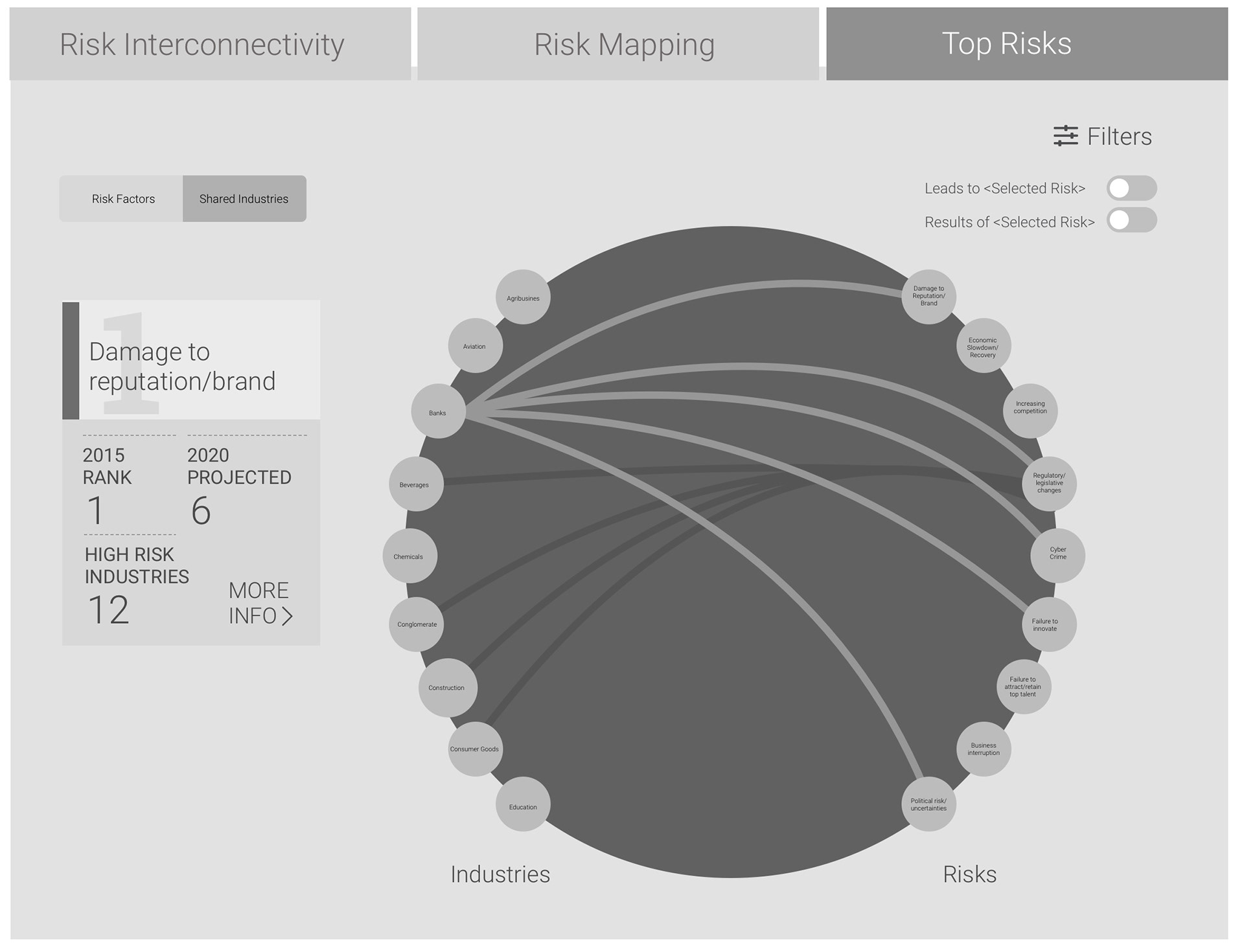

I also included an annotation tool to allow colleagues to share information with clients relating to their industry, as well as share important factoids from the report externally.
All graphs could be benchmarked if you or your business were a paid subscriber to Aon's data services, adding a nice bit of flavor to the allure of a large-scale report.
I took great pride in bringing these concepts to life in the wireframing phase - helping create a visually stimulating design language and offering up a viable solution to a complex problem (a dense website with thousands of pages created in the 90s) was an incredibly rewarding experience and provided a great opportunity to get into more data-focused concepts.
